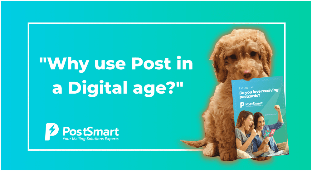
Get the most out of your direct mail campaign with design
Design is key to helping you stand out from the crowd and truly capture the attention of your audience – and we can help you do that.
Here are Jose’s ‘Top 3 Design tips’ to get the most out of your direct mail campaign, so that it can be much more effective and generate higher engagement and return on investment.
#1 Keep it simple:
You really want your marketing message displayed in a way that is as readable as possible, so don’t overload your direct mail design with too much information, elements, images, or super long paragraphs that no-one reads. Also make sure that your call to action visually stands out so your customer knows what action to take next.
2# Contrast + whitespace
The right combination of contrasting colours, different font sizes and whitespace (negative space) is an effective shortcut to grab your clients’ attention. So, don’t be afraid to leave a blank white space in your design because it will help define the rhythm of your design.
#3 Brand Consistency:
This one basic but critical and where we have seen many small and medium companies struggling with. Your Direct Mail campaign has to be consistent with your brand’s identity guidelines. It has to have the same look and feel across all your platforms, website, social media, so use your brand defined colours, fonts.
For more information on how great direct mail design can help grow your business then contact us today.